Neutral Paint Trends for Surrey Homes 2026
The residents of Surrey will adopt a new design style named “quiet luxury” during 2026. This style emphasizes discreet elegance through natural design elements and timeless architectural decisions, rather than showy decorations or seasonal design trends.
The movement is based on the selection of neutral paint colours, which serve a dual purpose. First, they emphasise beauty and create spaces that evoke a sense of calm and unity. They also retain their appeal over time.
The public shows growing interest in elegant neutral shades which Surrey Painters apply to their work at Guildford Georgian properties and Woking brand-new construction sites. The guide shows readers which neutral paint colours will define understated luxury in 2026. It also provides useful tips on achieving professional results that will retain their appearance for many years to come.
What Is “Quiet Luxury” in Interior Design?
The design movement called “quiet luxury” emerged to fight against maximalist design and the fast-changing nature of trendy home decor. The design draws inspiration from traditional craftsmanship and the effects of sunlight. It maintains a simple approach that focuses on superb craftsmanship rather than excessive ornamentation.
The room contains linen curtains which hang beside oak floors and brass fixtures that remain unpolished while multiple neutral tones on the walls shift their appearance as daylight passes by.
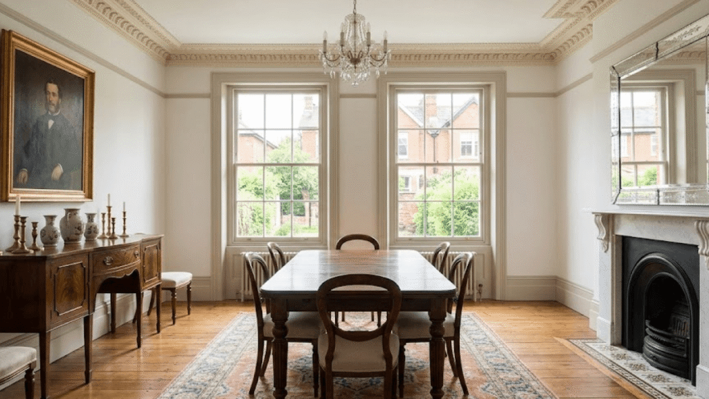
Designers have chosen warm neutral tones for their 2026 colour palette. These shades create sophisticated atmospheric effects, replacing the cool greys and whites that defined the previous decade.
Dulux revealed its 2026 Colour Forecast which shows UK homeowners prefer “grounded neutrals with organic undertones”.
Top Neutral Paint Trends for Surrey Homes in 2026
1. Warm Oatmeal and Linen Tones
The paint colors “Jitney” from Farrow & Ball and “Slaked Lime” from Little Greene offer a creamy base which contains green and grey tones. The colors work well with Surrey terrace homes which have north-facing rooms, because they create warm spaces that don’t block the restricted sunlight available.
2. Clay-Based Earth Tones
The Earthy Neutrals collection which draws from natural pigments includes two shades: “Mud” by Edward Bulmer and “Tallow” from Paint & Paper Library to create textured earthy looks for your home spaces. The mineral elements of these materials create an ideal match for lime plaster walls which receive support from reclaimed timber that proves perfect for historical properties.
3. Soft Greige (Grey + Beige)
The harsh greys of the 2010s are out. The new standard: greige which combines grey and beige into a neutral tone that doesn’t feel too cool or too warm. The neutral colors Dulux “Natural Hessian” and Benjamin Moore “Revere Pewter” serve as modern versatile choices which work well with both classic and contemporary home decor.
4. Muted Stone and Putty
The pale stone colors which include Farrow & Ball’s “Pebble Shore” and Earthborn’s “Bone” remind me of Surrey’s traditional flint cottages and its white chalk-covered hills. The tiles function well in kitchens and bathrooms, because they match perfectly with natural stone countertops and terracotta tiles.
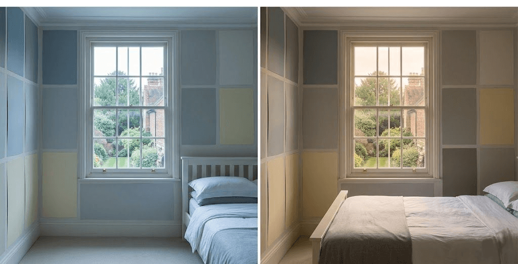
Pro Tip: Always test samples on multiple walls and at different times of day. Surrey’s variable light-bright in summer, flat in winter-can dramatically alter how a neutral appears.
How to Use Neutrals Effectively in Period and Modern Homes
For Period Properties (Pre-1940s)
- Avoid pure white: It clashes with original features like dark woodwork or ornate cornices.
- You should apply a darker neutral shade to your woodwork (such as skirtings in “Drop Cloth”) to establish a faint distinction between elements.
- The selection of breathable paints should include lime-washed and clay-based finishes, because these finishes enable solid-wall homes to handle moisture effectively.
Our guide about painting wooden windows in period homes shows how to achieve authentic results through matching wall colors with restored timber frames.
For New Builds and Extensions
- The developer-applied white walls create a sterile feeling which needs to be addressed. A warm neutral instantly adds character.
- The use of matt or soft-sheen emulsions enables you to create a unified space between open areas while preventing glare from appearing.
- You need to match your neutral color selection with your engineered wood flooring and porcelain tile installation.
Our new build decorator checklist provides guidance which helps you select finishing materials that improve standard base-level specifications.
Why Finish Matters as Much as Colour
Designers who practice quiet luxury interior design need to pay attention to how surfaces feel when touched and how materials bend light waves. The right sheen enhances depth without drawing attention:
- Matt emulsion: Ideal for walls-absorbs light softly, hides imperfections.
- Soft sheen or eggshell: Perfect for high-traffic areas like hallways and kitchens-offers slight wipeability while maintaining a low-lustre look.
- Water-based satinwood: For skirtings and doorsdurable, non-yellowing, and elegant.
Avoid high-gloss finishes unless used sparingly (e.g., on a single statement door). Quiet luxury is about restraint, not shine.
Common Mistakes to Avoid
- Choosing neutrals in isolation: Always consider fixed elements (flooring, fireplaces, window frames).
- The failure to recognize colour undertones leads to problems because beige colours with pink tones clash with oak flooring. Grey shades that contain blue undertones create cold atmospheres in rooms that receive no sunlight.
- The absence of surface preparation work will cause even the most expensive paint to develop an uneven appearance when applied to walls which lack proper preparation.
Surrey Painters provides complete surface preparation which includes filling and sanding and priming work as a standard service to make your neutral color scheme appear perfect.
Sustainability and Quiet Luxury
The quiet luxury approach maintains a strong connection with environmental protection practices. Many leading UK paint brands now offer:
- The Earthborn Claypaint brand delivers plant-based products which include its line of formulations.
- The products come in packaging which does not contain any plastic material.
- The finishes which support indoor air quality through their low-VOC composition enable breathable surfaces.
The method works for ethical purposes while it enables you to accomplish your objectives. Breathable paints protect older homes from damp problems by preventing condensation from forming. This helps prevent mould growth during Surrey’s wet weather.
Did You Know? The Building Research Establishment (BRE) rates clay and lime-based paints as “excellent” for indoor air quality under its Green Guide-a consideration increasingly valued by eco-conscious homeowners.
Concluding remarks
People who want quiet luxury need to spend their money on smart choices instead of making more purchases. Surrey homeowners who want peaceful sophisticated personal spaces should select warm neutral paints which they should apply with precise methods.
The year 2026 should become your time to discover how simple choices can create remarkable effects for your Victorian hallway renovation and new construction kitchen design. After all, true luxury whispers-it doesn’t shout.